Archived: Revisiting the Dependence of Scientific Productivity and Impact on Funding Level
A 2010 analysis by NIGMS and subsequent studies by others (Fortin and Currie, 2013; Gallo et al., 2014; Lauer et al., 2015; Doyle et al., 2015; Cook et al., 2015) have indicated that, on average, larger budgets and labs do not correspond to greater returns on our investment in fundamental science. We have discussed the topic here in A Shared Responsibility and in an iBiology talk. In this updated analysis, we assessed measures of the recent productivity and scientific impact of NIGMS grantees as a function of their total NIH funding.
We identified the pool of principal investigators (PIs) who held at least one NIGMS P01 or R01-equivalent grant (R01, R23, R29, R37) in Fiscal Year 2010. We then determined each investigator’s total NIH funding from research project grants (RPGs) or center grants (P20, P30, P50, P60, PL1, U54) for Fiscal Years 2009 to 2011 and averaged it over this 3-year period. Because many center grants are not organized into discrete projects and cores, we associated the contact PI with the entire budget and all publications attributed to the grant. We applied the same methodology to P01s. Thus, all publications citing the support of the center or P01 grant were also attributed to the contact PI, preventing underrepresentation of their productivity relative to their funding levels. Figure 1 shows the distribution of PIs by funding level, with the number of PIs at each funding level shown above each bar.
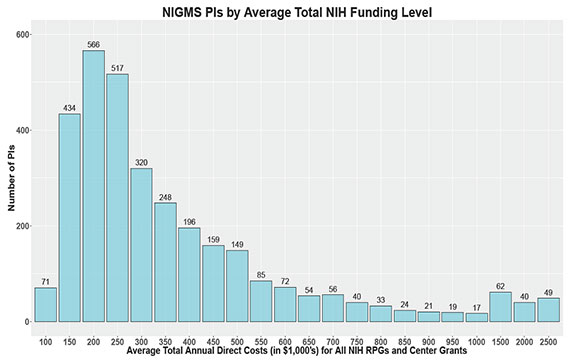
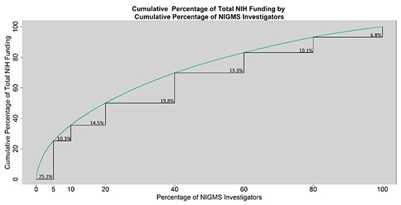
Figure 2 shows the distribution of funding among this group of investigators. The curved green line indicates the cumulative percentage of total NIH funding received by the cumulative percentage of most highly funded investigators indicated on the x-axis. The point (5, 25.2), for instance, shows that 5% of NIGMS investigators receive 25.2% of all NIH funding going to the group we analyzed; similarly, 20% of NIGMS investigators receive 50% of all NIH funding among this group.
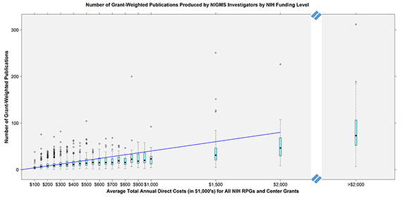
We next examined the productivity of these investigators in terms of publications as a function of total NIH funding. We plotted the number of publications from 2011-2015 associated with an NIGMS investigator’s NIH grants against the average total annual direct costs. We weighted the funding by the number of grants cited in the publication to control for overcounting papers that cite more than one of a PI’s grants and also to control for support provided to a project by other PIs. Figure 3 shows the boxplots of the number of grant-weighted publications for each funding level bin. The teal boxes represent the interquartile ranges, the solid black dots represent the medians and the circles above the boxes represent outliers. The diagonal blue line represents a theoretical line of proportionality in which constant returns are obtained to scale, given the median value of the first bin, so that a doubling in funding results in a doubling of productivity as measured by publications. While the number of grant-weighted publications produced by a PI follows an upward trend, the median of each bin above $300,000 of funding lies below the theoretical line of constant returns to scale. The same is true when publications are not weighted by the number of grants they acknowledge (data not shown).
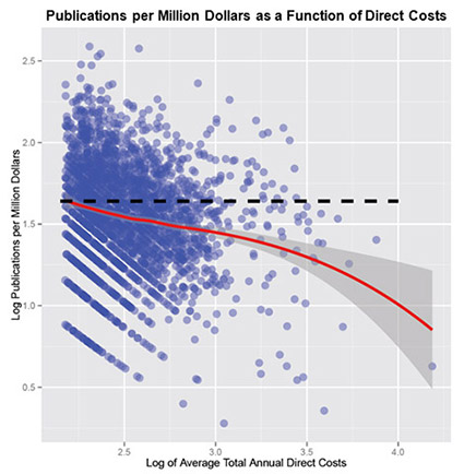
Another way to examine this trend is to look at the number of publications produced per dollar as a function of the amount of funding an investigator receives, which should stay constant if the number of publications produced is directly proportional to the amount of funding received. Figure 4 shows the log of the publications per million dollars plotted for each investigator against the log of that investigator’s average annual NIH funding. The red line is the fitted Loess curve with the 95% confidence interval of this fit shown in gray. The downward slope of the Loess curve indicates a declining rate of publication as the amount of funding increases.
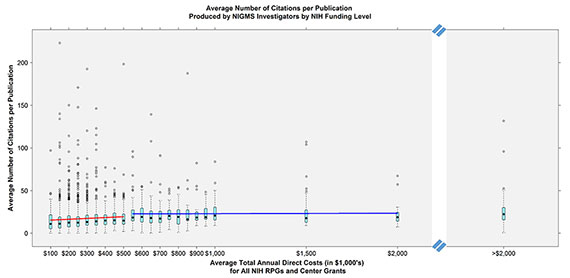
While the data suggest productivity does not follow constant returns to scale, one could also evaluate the overall scientific influence or impact of the publications. To assess impact, we looked at the average number of citations per paper accrued over the period of 2011-2015 for each PI as a function of NIH funding. Figure 5 shows the relationship between citations per paper and average annual NIH funding, which follows a relatively flat pattern, with only a small, discontinuous increase above $500,000. The number of citations per publication produced per thousand dollars decreases as funding increases. Investigators receiving an average annual NIH funding total between $200,000 and $250,000 garner an average of 0.074 citations per publication per thousand dollars of funding. This value falls to 0.04 for investigators receiving between $450,000 and $500,000, 0.03 for investigators receiving between $950,000 and $1,000,000, and 0.01 for investigators receiving between $1,500,000 and $2,000,000.
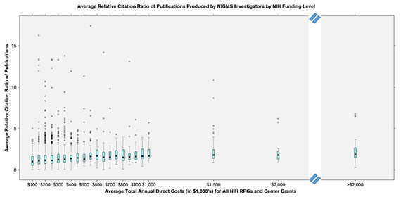
One limitation of using this type of citation count is that different scientific fields have different citation patterns, which raw citation counts do not take into account. For example, a PI in a large field may garner more citations per paper than one in a smaller field simply because of the number of people working in the area, which does not necessarily reflect the importance of the field. To address this limitation, we also analyzed each PI’s average relative citation ratio (RCR) as a function of total NIH funding level. This metric of scientific influence controls for field-specific citation effects, allowing for better comparison across research areas. Figure 6 shows the mean RCR for each PI as a function of total NIH funding level. Again, the data show a relatively flat response in mean RCR with increasing total NIH funding, with a small discontinuity after $500,000.
We conducted these analyses in a number of different ways, with each yielding similar results. In particular, leaving out center funding or investigators who were also supported by HHMI did not alter the findings (data not shown).
Although each of these metrics is an imperfect measure of scientific impact, taken together, the data support the conclusions of the previous studies mentioned earlier: Scientific productivity and impact do not scale proportionally with funding levels. We recognize that some science is inherently more expensive, for example because of the costs associated with human and animal subjects. Furthermore, a few investigators are more productive than the overall trend, with outputs meeting or even exceeding the theoretical line of proportionality in Figure 3. Overall, however, the data suggest that supporting a greater number of investigators at moderate funding levels is a better investment strategy than concentrating high amounts of funding in a smaller number of researchers. This is consistent with an objective of our 2015 strategic plan: Because we don’t know where important discoveries will come from or what lines of research will lay the foundations for them, sustaining a broad and diverse portfolio—in terms of scientific questions, institutions and investigators—is critical for maximizing the impact of the funding available for biomedical research.
About the Authors